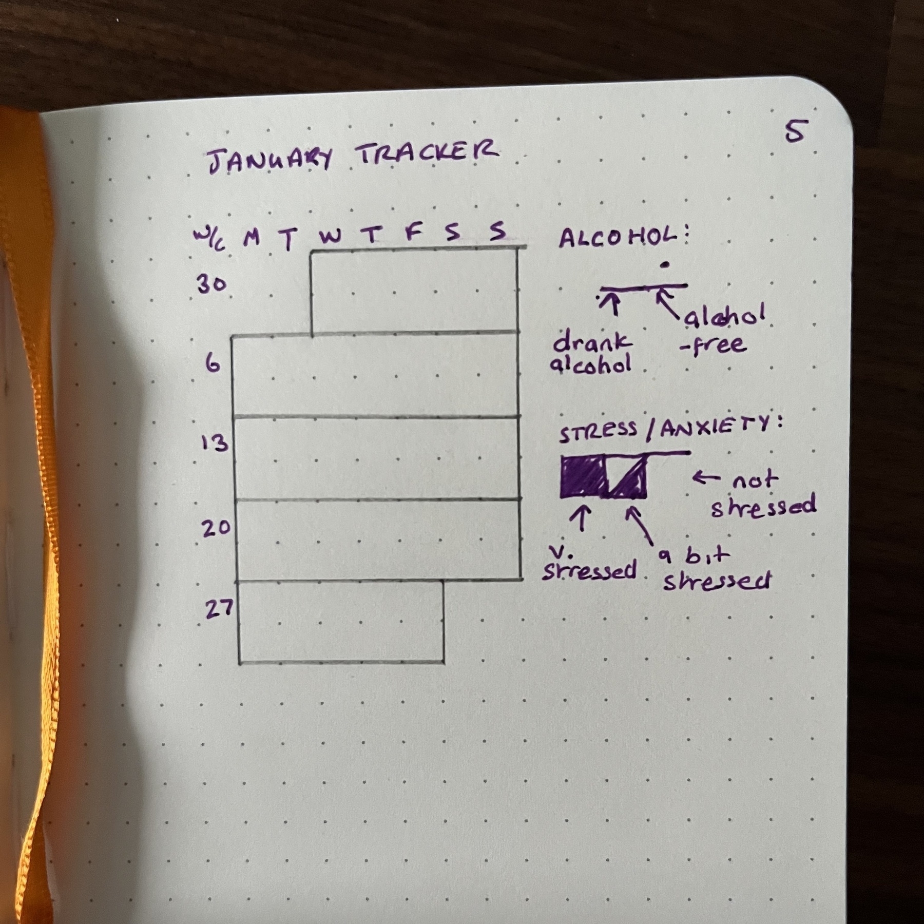
This is my tracker for January in my #BulletJournal.

I want to start off slowly, not put any real pressure on myself to do anything I wouldn’t normally do, and also test out a little theory. When I drink alcohol, I notice when I go to bed that my heart is beating pretty fast, and it makes it harder to fall asleep. I also get to thinking, like, I’m not an expert but surely hearts can also take so much, and having mine race while I’m literally just lying in bed can’t really be a good thing. So whether it leads from those things or whether there’s more to it, I think that alcohol might be making my anxiety worse. This is where this little tracker comes in.
Each day is represented by a rectangle, the top half of which is for tracking alcohol, and the bottom half is for tracking anxiety. At the end of the day I’m going to draw a line in pen that separates the two halves, then mark each half as appropriate.
I kind of wanted to be able to keep ‘alcohol-free’ as the cleaner-looking mark, but I think leaving alcohol-free blank and having a pen mark for the days I do drink is kind of having to record that you ‘failed’, rather than having a mark for an alcohol free day to record that you succeeded. So it’s just a dot, to try and keep it as clean looking as possible.
For the anxiety side, I considered having the ‘bit stressed’ icon have the lower bottom half of the square filled, that way it might resemble a kind of bar chart once the tracker is finished. But considering it’s over several lines anyway, I don’t think this would achieve much. Plus, I’m quite likely to be a little messy and it might look uneven. Cutting the square in half diagonally is easier to draw precisely so the final tracker might look a little bit more uniform this way. And the colour ‘density’ will still represent high, medium or low states of anxiety.
This time, the ‘not stressed’ mark is the cleanest one, which I think makes sense. I don’t think that colouring a square or half a square when I’ve felt anxious is like ‘admitting defeat’, so I don’t have an issue with it here. To me I think it’s a little bit more like being aware of, and expressing that anxiety.
I built in the ‘draw a line to separate the two halves’ rule so that if I miss a day, it’s easy to spot. Imagine a day where I drank alcohol and didn’t feel anxious - that would be denoted by blank boxes both top and bottom. Having the additional line means that this scenario looks different to the scenario where I just miss a day.
Overall I wanted to have the tracker look a little like a calendar. I usually don’t go to the effort to do this and just put everything in one vertical line instead, but I think work days and days off have an impact on both of the things I want to track and so being able to easily compare between days of the week will be useful in this case, I think.
I am hoping that just writing down the ‘week commencing’ date on the left will be enough to keep me oriented while I’m filling this in. With the days of the week across the top I think it should be okay. I know other trackers write the individual dates in each box but since I don’t want to use additional colours I think that could make it look a lot more cluttered. Not to mention that it’s just more work to set up too! I feel like the overall design isn’t too hard to redraw, if I want to use it again in later months.